What is an infographic and what is it intended for?

It is a medium where images and information are intertwined to make it easier to assimilate and remember content. Infographics are very popular on websites, and today they are almost essential for Internet users to quickly understand a topic. From the technical point of view, an infographic is created by an infographic designer using desktop publishing software. By combining text with image, a more visually attractive graphic information is obtained. Computer graphics are very popular on websites and they are used to summarise text, make it easier to read or highlight graphic or video content that makes it more interactive. A good website content will be perceived with high added value. It is also highly recommended to share it on the company’s social networks to generate more traffic on the website. In a content marketing strategy, this type of support has become a must have. Infographics are specifically effective in creating a company’s image. They make it possible for information to be more qualitative, while statistics have a much greater impact when they are presented in a colourful scheme. Visualisation makes more sense to the user. At first glance, the reader visualises the most important information.
What’s the purpose of translating an infographic?
In online marketing, translation is the main concern when it comes to SEO and website translation is not limited to text only. It is also necessary to transcribe all elements of the website, including computer graphics. The website’s infographics should also be translated so that they remain effective.
Translation enables practical information to reach foreign audiences. Similarly, potential customers from another country will be able to benefit from the company’s advice. Translated infographics also enable the presentation of specific data to foreign customers, or make it possible to present the company’s history. Finally, on social media, sharing a translated infographic is practical when it comes to increasing website traffic. Nevertheless, high-quality translation is a prerequisite for the infographic to remain effective and translating an infographic isn’t always easy for businesses. For this purpose, make sure that the infographic can be modified to keep its shape. Otherwise, it will be necessary to redesign the infographic in the target language, which will create extra work for the brand. So if the content is editable, it’s easier to translate. Especially since translation agencies often ask their clients for editable content to translate the infographics. This way, it is easier to prepare a high-quality translation and use SEO-specific techniques.
Which elements of the infographic should be translated?
Keep in mind that not only words or phrases are translated from one language to another, but most of all, the meaning is communicated. Pay attention to the context in which the infographic will be published so that you can adjust it to your target audience in the process of translation. For example, if you’re translating an infographic written for a blog post, you will most likely use a more informal language. On the other hand, if it is a translation of a brochure or printed material, the language used will be more official. The same rule applies when it comes to the tone: if the infographic is to be posted on a website or blog, it may have a more casual tone than if it is published in printed materials or an email newsletter. When translating the infographic into the target language, keep the following guidelines in mind:
– Don’t translate words literally
– Do not assume that the recipients will understand the concept of infographics (or even know what it is),
– Be sure that all text is legible and easy to read,
– Focus on communicating key messages clearly and concisely.
Advantages of translating infographics
1. Higher level of understanding. If you’re trying to get your message across, an infographic is a great way to do that! Not only is it easier to remember when compared to text, it’s also easier for the reader’s eyes to digest.
2. Reaching a global audience. By translating content into different languages, it is possible to reach more speakers of those languages (or at least understand them) all over the world.
3. Increasing the engagement rates. Whether it is social media or any other form of online marketing, engaging your customers is essential to keep them around long enough.
4. Presenting your company value through numbers on a website or in PowerPoint.
5. Distinction of the market research results,
6. Sharing infographics on social networks and thus generating an increase in traffic.
What are the types of infographics?
- Statistical infographic
- Informative infographic
- Timeline infographic
- Process infographics
- Geographic infographic
- Comparative infographic
- Hierarchical infographic
- List infographic
1. Statistical infographics
Statistical infographics are great for visualising survey results, presenting data from multiple sources, or illustrating a topic with associated data. Statistical infographics underline data with a specific layout and visuals to illustrate the information. Narrative slides can include diagrams, icons, images, and eye-catching fonts. The following infographic uses icons to illustrate each stat:

2. Informative infographics
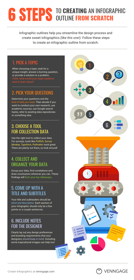
Informative infographics are ideal for clearly presenting a new or specific concept or giving an overview of a topic. Usually, an informative infographic is broken down into multiple sections using descriptive headings. To improve the readability of the design, consider numbering each section of the infographic. The informative infographic example below is one of the most popular types. The information is summarised in 5 points. Descriptive headings and icons help with clear illustration of each of them:

3. Timeline infographics
Timeline infographics are especially effective for visualising a story, highlighting important dates, or presenting an overview of an event. Since people tend to imagine time in space, a timeline infographic is the perfect way to portray it. Visual tips such as lines, icons, photos, and labels help with illustrating and contextualising points in time. The timeline infographic example below highlights each year with a larger font.

4. Process infographics
While timeline infographics are great for highlighting points in time, process infographics are great for presenting, summarising, or reviewing steps in a process. Process infographics help to simplify and explain each step. Most of these infographics have a simple layout, top to bottom or left to right. To make the process more readable, you can also add numbering to each step. The following process infographic template uses a different colour for the step headers. Notice how the colours match between the icon numbers and the headings, which makes them more legible.
5. Geographic infographics
Do you want to visualise data related to geographic positions, demographics, or a large amount of data? Try using a geographic infographic! Geographic infographics use mind maps as visuals. There are different types of mind maps that can illustrate your data. The geography infographic example below uses a heat map to rank different countries hierarchically.

6. Regardless of whether you want to compare different options impartially or highlight one option, a comparative infographic is the perfect solution here.
Comparative infographics are usually separated in the middle, either vertically or horizontally, with an option on both sides. The example below provides an objective comparison of the two smartphones. The compared specifications are presented in the middle part of the infographic, making it easy to compare the two devices:

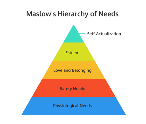
7. Hierarchical infographics
Hierarchical infographics help with organising information by importance or priority. One of the most famous examples is the Maslow Hierarchy of Needs. This visualisation of the pyramid represents the hierarchy of human needs, with the most important needs at its base and the least important ones at the top.
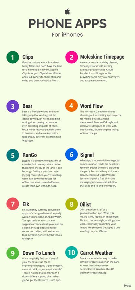
8. List infographics
If you want to share a list of tips, resources or examples, use… a list infographic!
List infographics are usually fairly simple as the main goal is to design lists that are more attractive and impactful than standard lists. Visual elements like icons replace standard bullets, and creative fonts and colours help to make each element stand out. To read the information in an easier way, simply number the items in the list. The following list infographic example uses coloured circle icons to highlight different points:
9. Today’s job market is so saturated that jobseekers need to find new and more creative ways to stand out. That is why CV infographics have become so popular in the last several years.
In most cases, CV infographics do not completely replace a traditional CV. However, they are the perfect means of communication to present during an interview, to be published on a portfolio page or embedded in an application submitted by email. The following resume infographic template features a neutral and minimalist colour scheme. A simple sidebar and icons emphasise the minimalist nature of this design.

In all of these practical aspects, translation plays a pivotal role in all elements of text as well as computer graphics, including drawings, which are no exception. Good quality of the translation will attract the attention of foreign recipients. It is worth remembering that an infographic can increase website traffic by up to 12%.
How to design your own infographic?
Before the finished project for translation reaches the hands of a professional translator specialising in the field of marketing, it is worth understanding the thinking and actions of the customer creating his/her own infographic. This is the best way to skilfully reproduce the context, i.e. the main message, in the target language.
Here are 5 steps to follow when preparing an infographic:
Step 1: Define the purpose of your infographic
Before you start thinking about the design, layout, graphics, or aesthetics, you should start by identifying the key goals of your infographic. In other words: what are the reasons for creating an infographic? These will not be high-level goals such as “synthesising complex information” or “improving site traffic”. They would rather involve clear, specific and achievable communication goals. Define the burning problem. Infographics are a great way to meet the specific expectations of recipients. These expectations are a key point that you need to include in your infographic. Use a question pyramid as it will allow you to transform the burning problem into a solution presented in the infographic. They will be the basis around which you will be able to tell a fascinating story. Supporting questions will reveal the basic information your audience will need to know to understand the main topic, as well as probing questions will reveal broader insights that should ultimately solve the key problem.

Step 2: Collect data for your infographic
You will need data to answer the questions defined in the first step. It would be great if you had your own data, so you can go straight to the third step. If you don’t already have data, don’t panic, as there is a huge amount of public data available on the Internet (the US alone produces about 2.7 million GB of data per minute). Search existing data repositories. While searching on Google is quick and easy, you often get messy data that needs sorting, which can be time-consuming. Browse data repositories for data that is ready to use.
UN Data: The United Nations Department of Statistics has more than 34 databases filterable by country, covering a variety of topics such as employment, poverty, population rates, growth, import/export etc.
Google Public Data: Google offers a public search engine solely dedicated to data. This is a good place to start your research.
World Bank: The World Bank holds a lot of high-quality financial and economic data.
World Economic Forum: The EC forum website provides reports with extensive data on a wide variety of topics.
Statista: This data aggregator is a paid service that provides thousands of exclusive and private data. If both of these strategies fail, you may need to collect your own data. To learn more about it, see our suggestions for doing your own research and read our comprehensive guide to data collection.
Step 3: Illustrate the data you want to be presented in your infographic
Now that you have the questions you want to answer and the data you need to provide answers, the next step is to choose how to visually illustrate the data. Start by defining the primary purpose of each piece of data based on the following characteristics: Inform, Compare, Change, Organise, Reveal Relationships, or Investigate. Then use best practices for each goal to find the best chart for your data. You want to convey an important message or data point that requires little context to understand. Highlight your stats with large, bold and coloured fonts.
Step 4: Lay out the elements of your infographic design
All you need to do is customise the layout. Sometimes it can be difficult to get the first item on a page, but there are a few tricks to make your selection easier. Create a natural flow of information. Use the question pyramid from the first step to guide your layout and information flow. Start by presenting the burning problem in the title, then include diagrams that answer the supportive questions, and end with diagrams that answer the probing questions. Use the grid layout to organise and balance out your infographic. Using a predefined symmetric grid to arrange different elements of an infographic is an easy and effective way to enhance your design. This technique, which allows the different elements to be organised, can allow the reader’s sight to shift from one element to the next (provided that you follow your natural reading direction from left to right).
Step 5: Add style to your design
How to choose fonts for your infographic? Start by writing your text. Keep it simple. Think of your infographic as a visual synthesis: texts should complement the visual elements and help you understand the main concepts. Reduce your texts to short, clear and understandable paragraphs. After you’ve written your text, choose a readable font for your main text, then increase the font size and style of your main header, section headings, and main data to ensure overall infographic consistency.
Translating an infographic
Translating an infographic certainly requires the use of a professional who has mastered the rules of this specific translation method to make the result even more relevant. Here are some tips for translators that an infographic designer should keep in mind:
· Create a source infographic so that it can be modified. This way you can translate your content in an easier way without having to recreate it from scratch for each language.
· Keep the form and only modify the background for multiple languages.
· Localise the content so that the message retains its full impact for foreign recipients. Pay attention to the length of the translated sentences/words. They need to stay within reasonable limits so the initial layout is not disrupted.
Don’t forget to translate your encrypted data as transcribing from one language to another also applies to the units of measurement that need to be converted.
Each country has its own cultural and linguistic specificity. You have to systematically adapt the content. This applies to the lexical aspect, the expressions, units of measurement – translation from French to English will not follow the same lexical rules as in England, Ireland or the United States. The same is true of Spain and Latin America.
Localisation of the content is therefore an indispensable element of every translation. It provides the guarantee of the correct reception of the content by the target audience. Undoubtedly, the translation of an infographic follows the scheme of marketing translations, so applying the translation principles specific to this industry will always be the best option. And the translated word is just the beginning.

Machine Translation (AI) vs. Professional Translation – When Are You Overpaying, and When Are You Risking It?
Machine translation can be synonymous with professional translation. Here is our recipe for success.
How much does it cost to translate product descriptions for an online store?
let the language barrier limit your sales potential. Professional e-commerce translation is the foundation of success in any foreign market.

A mistake that costs lives – a comprehensive guide to medical translation pitfalls
Medical translation errors can be fatal. Discover the most common pitfalls, from “false friends” to unit conversions, and learn how professional translation ensures safety.

Why website localization is the key to success in foreign markets?
Find out why website localization (and not just translation) is crucial for B2B success in foreign markets. Discover 5 benefits for your business.